
The BBC listed their sources, gave us the sampling methodology, and drew us some pietastic metrics.
But pie charts and surveys are not very good at illustrating qualitative responses.
Take this one:
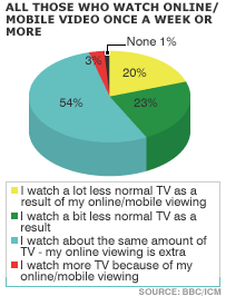
But where is the “I downloaded all the stuff I wanted to see, so I watched less real actual TV” or “Four hours on YouTube left me with one hour of BBC3 before gran told me to go to bed”? Under the label “normal TV”.
The venerable Beeb trudged on with their second tasty pie graphic:
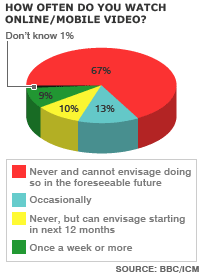
What do you mean, 1% of people don’t know? Did they forget?
Perhaps they don’t know what online/mobile video means. Are streaming adverts counted? Deck/landing pad animations?
Okay, so the pie thing is getting us nowhere. Let us Bring On The Bars.

The 55-64s are busy earning money or driving Porsches, the 65+ group is well into “da internets”, and the youth market is about 27% of the above pie’s 9% of respondents.
How do we translate these abbreviated findings of an overview report of a 2070-person survey into tangible market intelligence? It’s not impossible, it’s probably necessary to look at the material that makes up each viewing and each type of viewing.
But what if you didn’t need to, or couldn’t, differentiate amongst types of media, because that definition wasn’t core to the experience?